Get your dream website..
In 24 hours.
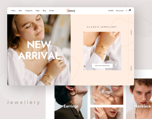
AI helps. You don't lift a finger. Beautifully designed for your business.
From chat to live site in 24 hours
Chat with our AI
5 minutesDescribe your dream website in the chat. No forms, no friction.
Designer gets to work
Within 1 hourA real human designer is assigned and starts crafting your website immediately.
Review & refine
24 hoursWe share a live preview. You get 3 rounds of revisions until it's perfect.
Go live
Seamless launchWe handle hosting, domain setup, and launch. Your beautiful site is live.
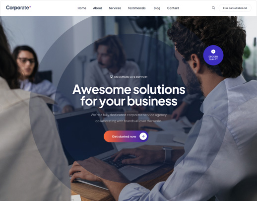
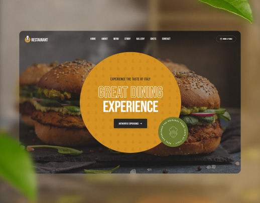
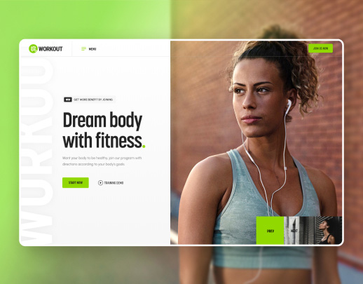
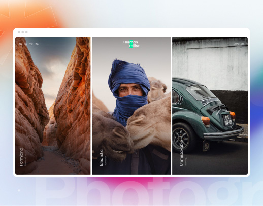
Why businesses choose us
Real human designer
Not templates. A trained designer personally builds your website from scratch.
AI-accelerated
Our AI tools help designers work 10× faster — premium quality at an honest price.
24-hour delivery
Fast doesn't mean rushed. Most websites are ready within a day.
Built for India
Pricing in ₹, GST-ready, multilingual support, designs that resonate with Indian audiences.
3 revision rounds
We revise until it's perfect — included in every package.
Fixed transparent pricing
No hidden fees, no hourly billing surprises. One clear price, everything included.

What our clients say
"I was skeptical about getting a great website so quickly, but Honest delivered beyond my expectations. My clients constantly compliment how professional it looks."
"The chat process was incredibly smooth. I just described what I needed and they handled everything. My law firm website was live in 18 hours."
"Fixed ₹ pricing with no hidden charges — finally! The design quality is on par with agencies charging 5× more."
Ready to build your
dream website?
Join 100+ Indian businesses who launched with Honest. Describe your vision and we'll handle the rest.
Get started for free →No payment required · A real designer assigned within 1 hour