
As we navigate the ever-evolving landscape of web design, the layout of a website stands as the architectural blueprint, shaping the user's journey and experience.
From minimalist single-page designs to immersive multimedia experiences, the possibilities are vast and pivotal.
As a team of seasoned designers, we have meticulously curated 11 diverse website layout design examples, each poised to spark inspiration and strategic insight for your next project.
Join us as we unravel the intricacies of these layouts and discover how they can elevate your digital presence, engage your audience, and drive impactful results.
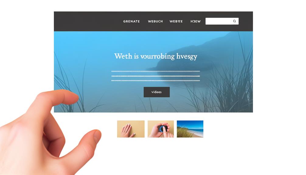
Single-Page Layout
The single-page layout offers a seamless and uninterrupted browsing experience for website visitors. It's ideal for those who desire a liberating online experience.
With a single-page layout, users can easily access all information without the need to click through multiple pages, providing a sense of freedom and efficiency. This layout can be visually impactful, especially with the use of parallax effects, adding a modern and dynamic touch to the browsing experience.
From a strategic standpoint, the single-page layout encourages visitors to engage with the content more deeply. They can quickly and effortlessly explore all the information in one continuous scroll. This layout aligns with the desire for liberation and a streamlined, user-friendly experience.
Text-Based Layout
Moving from our discussion on the seamless browsing experience provided by the single-page layout, let's now explore the concept of a text-based layout.
- Focused on Readability: Text-based layouts prioritize legibility and comprehension, making them ideal for content-heavy websites.
- Minimalist Design: Emphasizing textual content, these layouts often feature clean and simple designs, promoting distraction-free reading.
- Fast Loading Times: With fewer multimedia elements, text-based layouts can lead to faster page loading, enhancing the user experience.
- SEO-Friendly: Text-focused content can improve search engine visibility and accessibility, aiding in reaching a wider audience.
Text-based layouts offer a liberating approach by focusing on delivering clear and concise information while promoting seamless navigation.
Fixed Navigation Bar With Section Layout
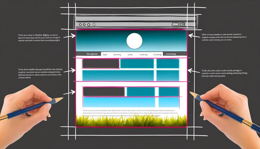
Enhancing website navigation and user experience, a fixed navigation bar with section layout provides seamless access to key content areas. This design feature ensures that essential navigation options remain visible as users scroll through the website. It simplifies the browsing experience and allows for quick transitions between different sections.
By keeping the navigation bar fixed, visitors can easily explore various parts of the website without the need to backtrack or search for specific links. This layout offers a strategic advantage by ensuring that important information and calls to action are readily available at all times, ultimately enhancing user engagement and facilitating smooth interaction with the website.
When considering website layout designs, the incorporation of a fixed navigation bar with section layout can significantly contribute to a liberated and fluid user experience.
Scrollable Animation Layout
By implementing a scrollable animation layout, we can captivate and engage users with dynamic visual storytelling and interactive design elements. This layout style offers a unique and engaging browsing experience, making it an excellent choice for websites aiming to captivate their audience.
Here's why the scrollable animation layout is a compelling option:
- Seamless storytelling: The animation elements allow for a seamless flow of storytelling as users scroll through the content.
- Interactive engagement: Interactive animations encourage user engagement and create a memorable browsing experience.
- Visual impact: Dynamic visual effects and transitions enhance the overall visual appeal, leaving a lasting impression on visitors.
- Enhanced user experience: By incorporating scrollable animations, the layout can provide a modern and immersive user experience, keeping visitors engaged and interested.
Single-Page Video Effect Layout
As we explore the topic of 'Single-Page Video Effect Layout', our goal is to continue engaging users with captivating visual elements and dynamic storytelling, building upon the seamless and interactive experience provided by the scrollable animation layout.
This layout incorporates engaging video content into a single-page design, creating an immersive and impactful browsing experience. By seamlessly integrating video effects, such as parallax scrolling and background videos, this layout captures the audience's attention and conveys compelling narratives.
It's ideal for showcasing products, services, or brand stories in a visually stunning and engaging manner. The single-page video effect layout offers a modern and creative approach to storytelling, making it an excellent choice for brands and businesses seeking to liberate their content with visually captivating elements.
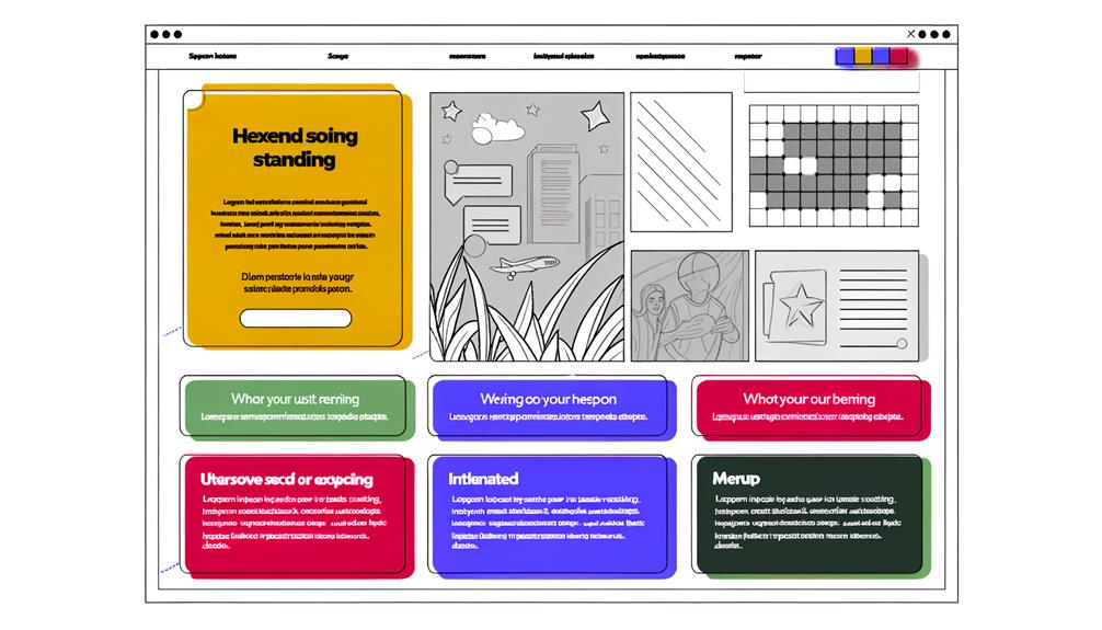
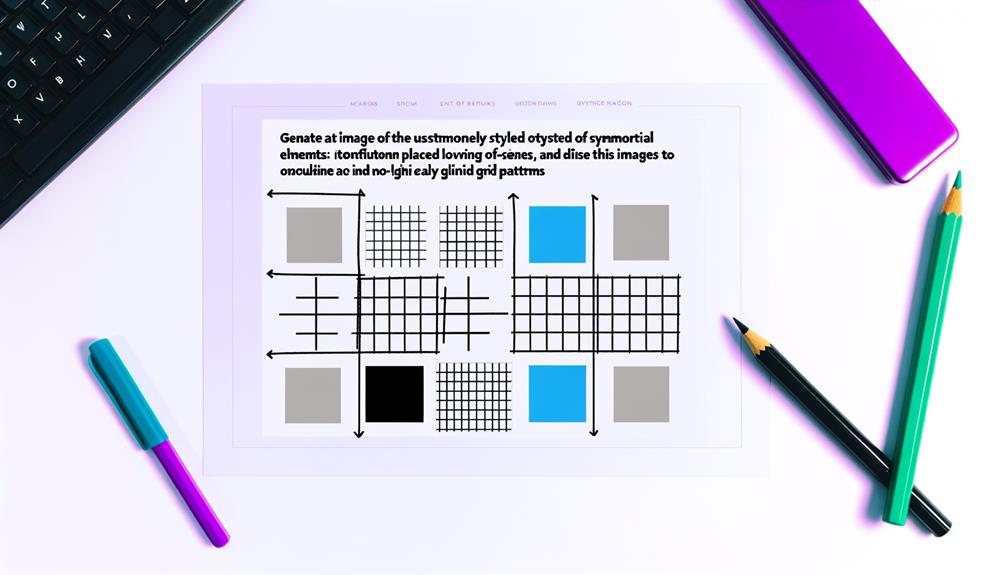
Grid Layout
The grid layout organizes content into columns and rows, providing a structured and balanced design for websites of various types.
- Grid layout offers a clean and organized look for the website.
- It ensures consistent alignment and spacing of content elements.
- Grid layout allows for easy content updates and modifications.
- It provides a versatile and adaptable design suitable for different types of websites.
Grid layout empowers us to create visually appealing and user-friendly websites that align with our brand identity while optimizing the user experience.
Asymmetrical Layout
We embrace the dynamic and captivating nature of asymmetrical layout design, leveraging its ability to create visually stimulating and unconventional website compositions.
Asymmetrical layouts offer a sense of liberation, breaking away from traditional symmetrical designs to deliver a more dynamic and engaging visual experience.
By intentionally disrupting the balance and creating visual tension, asymmetrical layouts capture attention and encourage exploration. This design choice allows for strategic placement of key elements, guiding the user's focus and creating a unique flow throughout the website.
Embracing asymmetry can convey a sense of creativity and innovation, making it ideal for brands that seek to stand out and make a bold statement.
When implemented thoughtfully, asymmetrical layouts can elevate the overall aesthetic and impact of a website.
Static Sidebar/Navigation Bar Layout
Embracing a static sidebar or navigation bar layout enhances the user experience by providing easy and accessible navigation throughout the website. Here are four reasons why this layout is beneficial:
- Easy Categorization: Organizing content into categories becomes effortless.
- Efficient Navigation: Users can easily access different sections of the website.
- Effective Content Organization: It simplifies the arrangement of content and improves user experience.
- Streamlined User Experience: Navigating through the website becomes readily accessible, enhancing overall user satisfaction.
This layout offers a strategic approach to website design, ensuring liberation for both users and designers by simplifying navigation and enhancing the overall user experience.
Single-Column Layout
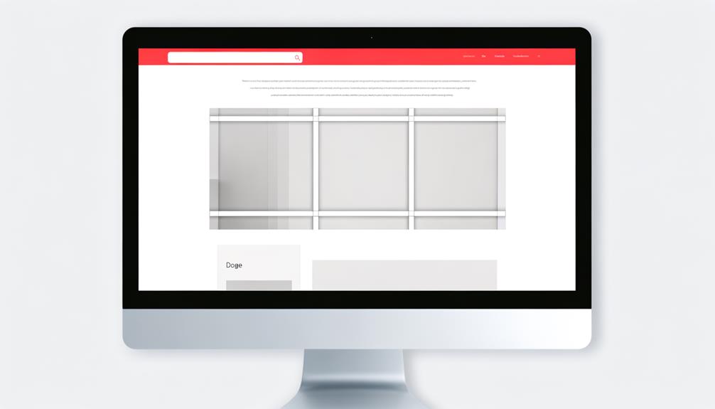
To maximize user engagement and streamline content presentation, the single-column layout offers a clean and straightforward design for websites. This layout is ideal for small businesses, personal blogs, or news feeds. It provides a seamless browsing experience, allowing for easy reading and content navigation. The single-column layout is consistent with social media sites and online forums. Below is a comparison table highlighting the key features of the single-column layout:
| Aspect | Single-Column Layout |
|---|---|
| Design Complexity | Low |
| Suitable for | Small businesses, personal blogs, news feeds |
| User Experience | Easy reading and browsing |
Fullscreen Hero Page Media Layout
Maximizing user engagement and content presentation, the Fullscreen Hero Page Media Layout offers a visually impactful and immersive design for websites. Here's why it's worth considering:
- Captivating Visual Experience: The full-screen layout creates a stunning first impression with high-quality images or videos.
- Enhanced Brand Storytelling: It allows for compelling storytelling and brand immersion, making a strong emotional connection with the audience.
- Modern and Minimalist Aesthetic: The full-screen design provides a sleek and contemporary look, aligning with current design trends.
- Responsive Adaptability: It ensures a seamless experience across various devices, catering to the freedom of accessing content on different screens.
For websites aiming to liberate users with visually compelling and immersive experiences, the Fullscreen Hero Page Media Layout is a strategic choice.
The Z-Style Layout
The Z-Style Layout arranges content in a dynamic and engaging manner, guiding users through a deliberate visual path. It starts with a horizontal movement at the top, leading the eye from left to right.
This is followed by a vertical movement, guiding the user downward. The layout then concludes with another horizontal movement, leading from left to right at the bottom of the page.
This strategic arrangement ensures that important information is presented prominently and that users are intuitively directed through the content. By utilizing the Z-Style Layout, websites can captivate and liberate users by delivering an organized and compelling visual journey.
Its deliberate structure enables effective storytelling and seamless navigation, making it a powerful choice for engaging and user-friendly web design.
Frequently Asked Questions
How Can Website Layout Design Impact SEO and Search Engine Rankings?
Website layout design impacts SEO and search engine rankings through factors like user experience, mobile-friendliness, and site speed.
A well-structured layout enhances navigation and content visibility, contributing to lower bounce rates and longer dwell time.
Responsive designs ensure accessibility across devices, boosting SEO performance.
Additionally, clear information hierarchy aids search engine bots in understanding and ranking content.
Optimizing website layout can thus positively influence SEO and search engine rankings.
What Are Some Common Mistakes to Avoid When Designing a Website Layout?
When designing a website layout, we must avoid common mistakes such as cluttered interfaces, complex navigation, and inconsistent branding. These can hinder user experience and impact SEO.
Clear, intuitive navigation, responsive design, and cohesive branding are crucial. Additionally, optimizing loading speeds, avoiding excessive pop-ups, and ensuring mobile compatibility are essential for a successful layout design.
These considerations can enhance user engagement and search engine rankings.
How Can Website Layout Design Contribute to Brand Storytelling and Identity?
Website layout design contributes to brand storytelling and identity by creating a visual narrative that resonates with users. It sets the tone, conveys brand values, and evokes emotions through strategic placement of elements.
Consistent visual cues and cohesive design reflect brand identity, enhancing recognition and connection. Engaging layouts immerse users in the brand's story, fostering a memorable experience.
This strengthens brand identity and fosters a lasting impression.
What Are the Key Elements to Consider When Designing a Mobile-Responsive Website Layout?
When designing a mobile-responsive website layout, we prioritize user experience, ensuring seamless navigation and readability across devices.
Key elements include clear content hierarchy, flexible grid systems, and scalable typography.
We prioritize touch-friendly elements and optimize loading times for mobile.
Our strategic approach aligns with brand identity and targets user engagement.
Ultimately, our mobile-responsive design enhances the accessibility and functionality of the website.
How Does User Behavior and Psychology Influence the Effectiveness of Different Website Layout Designs?
User behavior and psychology strongly influence the effectiveness of website layout designs. Understanding user preferences and behaviors guides our strategic design choices. We prioritize seamless navigation, visual appeal, and clear information hierarchy to resonate with users.
Conclusion
In conclusion, the website layout design examples presented here offer a wealth of inspiration and insights for your next project. By considering the diverse range of layouts, from single-page to immersive designs, you can elevate user experience and drive conversions.
Selecting the most suitable layout for your goals and target audience is crucial, and our collection provides valuable considerations to guide your decision-making process. Let these examples empower you to create impactful and engaging web designs.