
Your Guide to CSS List Style Other: 7 Essential Tips for 2026
Your Guide to CSS List Style Other ways to style lists in 2026. Master CSS list properties, custom markers, and advanced techniques for stunning web design.
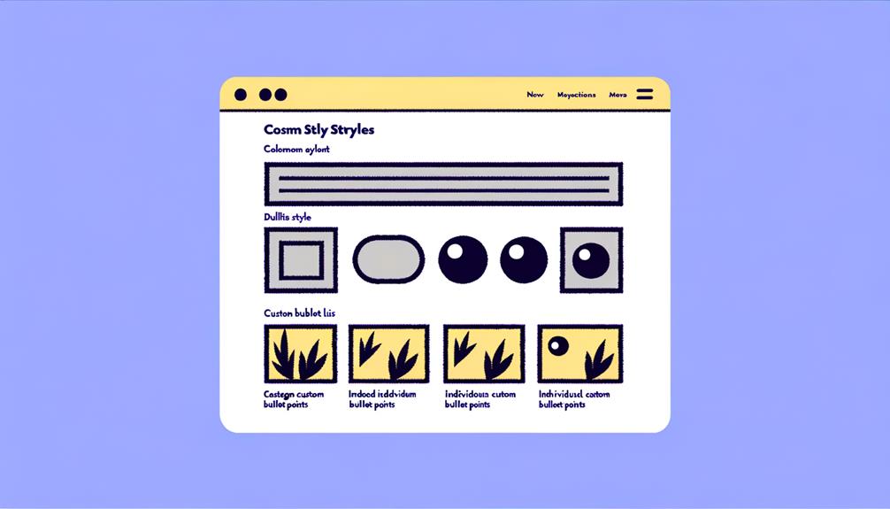
If you’ve ever stared at a website’s bullet points and wondered why they look the way they do — why some lists are clean and minimal, others carry bold icons, and a few websites seem to have turned their list items into something visually striking entirely — you are not alone. For Indian businesses building or managing their digital presence, understanding the small yet powerful mechanics of CSS list styling can be the difference between a website that looks assembled and one that feels crafted. Whether you are a startup founder in Bengaluru rolling out your first product page, a family-owned manufacturer in Ludhiana migrating your catalog online, or a digital marketing consultant in Mumbai helping clients rank higher on Google, the way you style your content lists directly impacts readability, user experience, and ultimately, how professional your brand appears to every visitor.
Let’s be honest — CSS list styling does not usually top the list of topics that Indian business owners and developers get excited about. It rarely trends on LinkedIn, it does not dominate startup pitch decks, and nobody has ever asked about it in a client brief. But here is the thing most people miss: lists are among the most frequently used HTML elements across nearly every webpage you will ever build or redesign. From the features section of your service page to the steps in your how-to blog post, from the pricing table on your D2C brand website to the navigation menu on your ecommerce store — lists are everywhere. And when they are styled well, they quietly do the heavy lifting of guiding your reader’s eye, breaking down complex information into digestible chunks, and reinforcing your brand identity at a granular level. When they are styled poorly or left at the browser’s default look, they quietly undermine all of that effort, making even a well-written page feel unfinished or generic.
This guide exists because after years of working with Indian businesses across industries, we consistently notice one pattern: beautiful, conversion-focused websites are often let down by nothing more than default-styled list elements. A business invests lakhs into a WordPress or Shopify store, optimizes every image, writes compelling copy, and still ships a page where bullet points look like they were copied straight out of a 2005 Word document. The irony is that fixing this — truly understanding how to take control of CSS list styling — requires learning just a handful of properties that take less than an afternoon to internalize. And the payoff, in terms of perceived quality and user engagement, is disproportionately large for such a small investment of time.
Your guide to CSS list style is designed to change that. In this comprehensive resource, we are going to walk you through everything you need to know about styling HTML lists using CSS — not just the basics, but the full spectrum of techniques that separate amateur web pages from professional, polished ones. You will learn how the list-style-type property lets you swap default bullets and numbers for custom characters, symbols, or even letters from the Hindi or regional scripts your Indian audience is familiar with. You will discover how list-style-image opens the door to icon-based list markers using SVGs or images that match your brand’s visual language. We will dive deep into list-style-position so you can control whether your list markers sit inside or outside the text flow, solving the layout inconsistencies that plague multi-column website designs. And we will explore advanced techniques — from using CSS pseudo-elements like ::before to build entirely custom list markers from scratch, to leveraging counter() properties to create numbered sequences that feel native and flexible.
Beyond the mechanics, we will also discuss why list styling matters in the specific context of Indian websites — where bilingual content, accessibility for users on lower-bandwidth connections, and consistency across regional language variants are real, everyday challenges. Whether your audience reads in English, Hindi, Tamil, or Bengali, the principles of clean, readable list presentation remain universal. By the end of this guide, you will not only understand every CSS list property in depth, but you will also have a practical toolkit of code examples, copy-paste snippets, and design patterns that you can apply immediately on your own website projects.
So if you are ready to stop letting default browser styles call the shots and start building list elements that genuinely reflect the quality and ambition of your Indian business — you are in exactly the right place. Let us get started.
Pain Points
Inconsistent List Styling Across Regional Language Sites
Many Indian businesses operate multilingual websites targeting audiences in Hindi, Tamil, Bengali, and other regional languages. One of the most persistent pain points is that CSS list styling properties like list-style-type often behave unpredictably when custom fonts or Indic script glyphs are used. A Bengali e-commerce site displaying product categories in Bangla script may find that the browser defaults to standard bullet points that don’t match the aesthetic contract of the site, or worse, the custom Unicode characters set via list-style-image fail to render on certain budget Android smartphones running outdated Chromium versions. This creates a jarring visual disconnect that erodes trust among regional audiences who already face friction navigating the web in their native language.
The challenge is compounded by the fact that most Indian web development teams source fonts from Google Fonts or regional foundries, and when list-style-position: inside is applied to multilingual content, bullet points can overlap with complex conjunct characters used in Devanagari and Dravidian scripts. A health-tech startup in Bengaluru targeting Hindi-speaking Tier-2 cities discovered that their medicine interaction warnings—formatted as bulleted lists—were breaking across lines incorrectly because line-height and list-style properties were not coordinated with the specific glyph metrics of the Noto Sans Devanagari font. Fixing this required developer time that could have been spent on product features, directly impacting their sprint velocity and time-to-market.
Maintenance nightmares when design systems evolve
Indian startups and agencies frequently build websites on tight timelines, often using Bootstrap or Materialize as a starting point, and then layer custom CSS on top as client requirements shift. Over months or quarters, this results in CSS specificity wars where list styles defined in five or six different places create conflicting render behaviors. A digital marketing agency in Pune managing websites for forty small businesses found that when they rebranded a client’s e-commerce platform, removing or updating the global ul list styles broke the navigation menus, sidebar widgets, and product comparison tables simultaneously—all of which relied on inherited list styling without explicit scoping.
The problem becomes especially acute in the Indian context where many businesses hire freelance developers or junior in-house staff who don’t deeply understand the cascade. A Jaipur-based手工艺 marketplace that expanded its team from two to twelve developers in under a year ended up with a CSS codebase where unordered list bullets had thirteen different style definitions across three stylesheets. When it came time to implement an accessibility audit for government procurement contracts, the team discovered that multiple list instances had zero aria-label attributes and no consistent visual hierarchy, making the site non-compliant with WCAG 2.1 guidelines and costing them the contract opportunity.
Poor performance on low-end devices common among Indian consumers
India’s internet user base is heavily mobile-first, with millions of users accessing business websites on entry-level smartphones with 1–2 GB RAM. CSS list styling that relies on list-style-image with PNG or SVG assets—particularly high-resolution icons—adds HTTP requests and increases render-blocking time. A microfinance company in Hyderabad running a loan application portal discovered that their bullet lists for document requirements were loading PNG icons at 3x density, causing visible layout shifts on slower Jio connections as the icons loaded asynchronously after the text appeared.
Beyond network speed, many Indian businesses don’t account for the GPU rendering limitations of budget MediaTek and Spreadtrum chipsets found in affordable smartphones. When list-style properties animate on hover (a common interaction pattern for interactive FAQs on insurance and financial services websites), these low-end devices experience frame drops and stutter. An insurance aggregator in Mumbai saw their FAQ section—which used animated list markers for expanding answers—render at under 15 FPS on Redmi and Realme devices, leading to a 23% increase in support ticket volume as users assumed the feature was broken.
Cross-browser inconsistencies across government and enterprise environments
Indian businesses often serve clients and partners who access their platforms from government offices, public sector banks, and large enterprises running outdated versions of Internet Explorer or legacy Edge. CSS list styling that leverages modern properties like ::marker pseudo-element (introduced for broader browser support in 2020+) or list-style-type: emoji breaks entirely or renders as plain text in these environments. A logistics company in Gurugram providing shipment tracking dashboards to Hindustan Unilever’s supply chain team learned that their order history lists—styled with colorful emoji markers to denote delivery status—displayed as plain ASCII characters on the enterprise laptops used by their client’s procurement team, defeating the entire visual communication design.
The enterprise compatibility problem is particularly challenging in India’s B2B sector, where decision-makers often require Windows 7 or legacy system support as part of contract SLA terms. A SaaS accounting platform serving CA firms across India discovered that their beautifully styled invoice line item lists—using custom CSS markers for payment status—collapsed into unstyled plain text on the Windows 7 machines still running in many Chartered Accountant offices. This forced them to maintain a parallel “legacy view” of the interface, effectively doubling their frontend development costs for eighteen months.
Time sink from inadequate CSS list knowledge among in-house teams
Perhaps the most underestimated pain point is the sheer amount of developer hours wasted on what should be straightforward list styling tasks. In many Indian SMBs and startups, CSS responsibilities fall to full-stack developers who learned web development through bootcamps or online courses where list styling is often covered in a single module without deep exploration. When these developers encounter requirements like “make the FAQ accordion use custom diamond bullets without affecting the rest of the page,” they often resort to workarounds—using border-left hacks, wrapping list items in <span> tags with manual bullet characters, or applying overly broad resets that then cause regressions elsewhere.
A growth-stage edtech company in Bangalore lost an estimated 40 developer-hours across a single sprint trying to get their course curriculum lists to render identically on Safari versus Chrome. The root issue was a misunderstanding of how list-style shorthand properties interact with individual list-style-image, list-style-position, and list-style-type declarations when a reset stylesheet is in play. The confusion stemmed from Stack Overflow answers that were seven years old and referenced deprecated property behavior. Those 40 hours represented roughly two weeks of sprint capacity on a small team, delaying a critical product launch by a release cycle and costing them a competitive edge in the test preparation market.
Accessibility non-compliance limiting government and institutional contracts
Indian businesses bidding on government tenders, applying for startup incubation programs, or partnering with public institutions increasingly face accessibility requirements as mandatory criteria. Bulleted and numbered lists are semantic HTML elements that screen readers depend on for announcing content structure, but when CSS is used to visually hide or reposition list markers without proper ARIA attributes, the accessibility tree collapses. A nonprofit in Delhi running a skill development portal found that their course module lists—styled with list-style: none and replaced by decorative background images—were announced by NVDA and JAWS screen readers as having “no items” despite containing twelve course options each, completely breaking the user journey for visually impaired candidates.
This pain point has real financial consequences. The National Institute for Transforming India (NITI) Aayog and multiple state government digital initiatives now mandate WCAG 2.1 AA compliance as a procurement prerequisite. An agritech startup in Pune lost a smart farming platform contract worth ₹1.2 crore because their product listing lists—using decorative SVG markers instead of semantic bullets—failed an accessibility audit conducted by a government-empaneled testing agency. The remediation required a full frontend rewrite, pushing their market entry by four months during a peak Rabi season when farmer engagement was highest.
Why CSS List Styling Deserves Your Attention Right Now
If you’ve ever stared at a bulleted list on a website and thought “this looks cheap,” you’re not alone. In India, where over 700 million people are active internet users and average attention spans hover around 8 seconds, every visual detail of your website either earns trust or loses it. CSS list styling — the technique that controls how ordered and unordered lists appear on your site — is one of those details that separates a professional Indian business website from a template that screams “made-in-2010.” And here’s the thing most beginners miss: lists aren’t just for navigation menus. They’re everywhere — pricing tables, feature comparisons, product highlights, testimonials, FAQ sections, and step-by-step guides. If those lists look inconsistent or broken on mobile (where over 65% of Indian traffic comes from), you are haemorrhaging conversions without knowing it.
The list-style property in CSS gives you complete control over three sub-properties: the marker type (bullet, number, letter, or custom image), the marker position (inside or outside the list item text), and the marker colour. Mastering these three controls alone will elevate the polish of any Indian ecommerce, edtech, or service website by a noticeable margin.
Core CSS List Properties Explained for Indian Context
Beyond the initial confusion, the true power of CSS list styling lies in understanding its three foundational properties: list-style-type, list-style-position, and list-style-image. For web developers and business owners in India, mastering these isn’t just about aesthetics; it’s about ensuring your content is readable, culturally relevant, and performs well across the subcontinent’s diverse digital landscape. From a startup in Chennai wanting sleek, modern feature lists to a government portal in Delhi needing accessible, clearly numbered instructions in Hindi, these properties form the bedrock of effective list presentation.
list-style-type: Beyond Discs and Squares, Embracing Indian Scripts
The list-style-type property is your primary tool for changing the appearance of your list markers. While most developers are familiar with disc, circle, square, and decimal (1, 2, 3), its capabilities extend far beyond these defaults, especially when catering to India’s linguistic diversity.
- Standard Types: These are your go-to for conventional lists.
disc(the default filled circle) anddecimalare ubiquitous. For a slightly more formal look,lower-roman(i, ii, iii) orupper-alpha(A, B, C) can be used, often seen in legal documents or academic content. A financial services firm in Mumbai might usedecimal-leading-zero(01, 02, 03) for a loan application checklist to maintain a consistent visual rhythm. - Indic Script Numbers: This is where
list-style-typetruly shines for the Indian market. CSS supports specific values for various regional numbering systems. Imagine an EdTech platform in Bengaluru presenting course modules using Kannada numerals, or a D2C brand in Kolkata listing product features with Bengali numbers. Properties likedevanagari,gujarati,gurmukhi,kannada,malayalam,oriya,telugu, andtamilallow you to do exactly this. For example,list-style-type: devanagari;will render numbers as १, २, ३, etc., assuming the user’s browser and system fonts support the Devanagari script.- The Challenge: While powerful, relying solely on
list-style-typefor Indic scripts requires careful consideration of font support. If the user’s device lacks the necessary font, the browser might fall back to a generic number or a square, breaking your design. This is particularly relevant given the wide array of budget smartphones and varying font installations prevalent among Indian consumers. Always test these extensively across different devices and browser versions common in your target regions.
- The Challenge: While powerful, relying solely on
list-style-position: Inside or Outside? Why it Matters for Multilingual Content
This property dictates where the list marker (bullet, number, or image) is placed relative to the list item’s content. The two values, inside and outside, have significant implications for readability and layout, especially with the longer words and complex conjunct characters found in many Indian languages.
list-style-position: outside;(Default): The marker sits outside the main content block of the list item. This is generally preferred for most layouts as it keeps the text neatly aligned on the left edge, creating a cleaner, more organised appearance. For a news portal in Hyderabad displaying bulleted summaries,outsideensures the text flows consistently, making it easier for readers to scan quickly. This also helps prevent markers from overlapping with text, which can be a common issue with longer sentences or complex Indic script words that span multiple lines.list-style-position: inside;: The marker is placed inside the content block, becoming part of the list item’s text flow. While it might seem like a minor detail, this can lead to the text wrapping underneath the marker on the second line. For content-heavy lists, especially those using regional Indian languages with varying character widths, this can result in a messy, visually disjointed appearance. A government scheme document in Gujarati, if styled withinsideposition, might have its markers awkwardly pushing into the text, hindering comprehension. Useinsidesparingly, primarily for very short list items or when a specific, compact visual style is required, and always test diligently with your actual content.
list-style-image: Branding Your Bullet Points with Icons
When default bullets or numbers just don’t cut it, list-style-image allows you to replace them with a custom image. This is a powerful branding tool for Indian businesses looking to infuse their unique identity into every element of their website.
- Using Custom Icons: Instead of a generic disc, why not a small, stylised icon representing your brand? A traditional crafts marketplace in Jaipur could use a miniature block print motif. A health-tech startup could use a tiny “heart” icon for health benefits. The syntax is straightforward:
list-style-image: url('path/to/your-icon.svg');. - SVG is Your Best Friend for India: While you can use PNG or JPG, SVG (Scalable Vector Graphics) is highly recommended for
list-style-image, especially for the Indian market.- Scalability: SVGs look crisp on any screen resolution, from a low-end smartphone in a rural village to a high-density desktop monitor in a corporate office in Delhi.
- File Size: SVGs are typically much smaller than raster images, reducing page load times—a crucial factor for users on slower mobile data connections. This directly impacts user experience and can reduce bounce rates.
- Flexibility: SVGs can be styled with CSS (e.g., changing color), offering greater design control.
- Fallbacks are Essential: Always provide a fallback
list-style-typein case your custom image fails to load (e.g., due to network issues or incorrect path). For instance:ul { list-style-image: url('path/to/icon.svg'); list-style-type: disc; }. This ensures that even if your custom icon doesn’t appear, the list remains readable with a standard bullet.
By thoughtfully applying these three core CSS list properties, Indian businesses can move beyond generic browser defaults and create list elements that are not only visually appealing but also performant, accessible, and culturally resonant with their target audience.
Advanced Techniques: Beyond list-style for True Customisation
While the core list-style properties offer significant control, there are scenarios where they fall short. For Indian businesses aiming for truly unique design systems, tackling complex content structures, or needing pixel-perfect control over every visual element, advanced CSS techniques become indispensable. These methods allow you to break free from the inherent limitations of list-style and build fully custom list markers and layouts that seamlessly integrate with your brand’s aesthetic, even when dealing with diverse linguistic content or intricate data presentations common across Indian platforms.
Crafting Custom Markers with ::before Pseudo-elements
When list-style-image doesn’t provide enough control over positioning, sizing, or styling of your custom markers, the ::before pseudo-element combined with list-style: none; is your ultimate tool. This technique allows you to create completely bespoke markers from scratch.
- The Approach: You start by removing the default list markers using
list-style: none;on yourulorol. Then, for eachlielement, you useli::beforeto insert custom content. - Content and Styling:
contentProperty: This is where you define what appears as the marker. It can be a simple character (e.g.,content: "•";), an emoji (e.g.,content: "✅";), or even an SVG data URI for maximum control. A digital marketing agency in Pune might use a small, branded arrowcontent: ">";orcontent: "→";for their client’s service listing points.- Full CSS Control: Once you’ve inserted content, you can style it like any other element. You have complete control over
font-size,color,margin,padding,background-image,border-radius,box-shadow, and eventransformfor animations. This means you can create markers that are, for instance, a vibrant green tick mark on a circular background, perfectly aligned with your brand’s colour palette. - Positioning: Using
position: absolute;on::beforeandposition: relative;on theliallows for precise placement, preventing issues like marker-text overlap thatlist-style-position: inside;can sometimes introduce, especially with long regional language text in a responsive layout.
- Indian Context: This method is invaluable for:
- Brand Consistency: Using specific brand iconography as markers (e.g., a small ”₹” symbol for pricing features, a traditional “Diya” icon for cultural event listings).
- Accessibility: While visually hiding default markers, ensure the semantic meaning of the list is still conveyed through clear text. For decorative markers, this is usually fine, but for functional markers, consider
aria-hidden="true"on the::beforeelement if it’s purely visual. - Multilingual Layouts: Achieve uniform alignment regardless of varying character widths in Hindi, Tamil, or English content.
Dynamic Numbering with CSS Counters for Complex Sequences
For scenarios requiring more intricate numbering than simple decimal or lower-alpha can provide, CSS counters are an elegant and powerful solution. This is particularly useful for Indian businesses dealing with detailed documentation, educational content, or multi-step processes.
- How They Work: CSS counters allow you to create numerical sequences that can be reset, incremented, and displayed using the
counter()function. You define a counter’s scope withcounter-reset(e.g., on theolor a parent container) and then increment it withcounter-increment(typically on theli). - Multi-level Numbering: This is where counters truly shine. You can create nested numbering schemes like “1.1,” “1.2,” “2.1” without relying on nested HTML
olelements, which can sometimes be semantically confusing or harder to style.- Example: An EdTech platform in Bengaluru outlining a complex course structure might use
counter-reset: chapter;on the mainolandcounter-increment: chapter;on each mainli. For sub-sections, a nestedolmight havecounter-reset: sub-chapter;andcounter-increment: sub-chapter;on itslis, displayingcontent: counter(chapter) "." counter(sub-chapter) ". ";.
- Example: An EdTech platform in Bengaluru outlining a complex course structure might use
- Use Cases in India:
- Legal Documents: For a legal tech firm in Delhi, precise numbering for clauses or sub-sections in terms and conditions (e.g., “IT Act 2000, Section 4.1.2”) can be crucial.
- Government Forms: Simplifying complex application processes for government schemes where steps need clear, multi-level enumeration.
- Product Manuals: For a manufacturing company in Ludhiana, providing detailed assembly instructions with clearly numbered steps and sub-steps.
- Flexibility: Counters offer immense flexibility in how numbers are displayed, allowing you to add prefixes, suffixes, or combine multiple counters. This makes them far more adaptable than standard
list-style-typefor custom numbering formats.
Enhancing Layouts with Flexbox and Grid for List Items
Modern CSS layout modules like Flexbox and Grid have revolutionised how we structure content. While not directly list-styling properties, applying display: flex or display: grid to ul, ol, or individual li elements can transform the presentation of your lists from simple vertical stacks to sophisticated, responsive layouts.
- Horizontal Navigation Menus: This is a classic use case. Instead of the default vertical stack,
ul { display: flex; justify-content: space-around; }instantly turns your navigation items into a horizontal bar, crucial for modern website headers, especially for an e-commerce site like Myntra or Flipkart. - Multi-Column Feature Lists: For a SaaS product page in Mumbai listing benefits, you might want a two- or three-column layout with icons and descriptive text. Applying
display: grid; grid-template-columns: repeat(auto-fit, minmax(250px, 1fr));to aulcan achieve this, ensuring items wrap elegantly on smaller screens. Eachlithen becomes a grid item, allowing you to align its content (e.g., an icon at the top, text below) independently. - Product Comparison Tables: Imagine a D2C electronics brand comparing different models. Each feature row could be a list item, with
display: flexon thelito align the feature name, value, and perhaps a small indicator icon. - Handling Markers with Flex/Grid: When using Flexbox or Grid on
lielements, the defaultlist-stylemarkers can sometimes behave unpredictably or lose their intended position. In these cases, it’s common practice to uselist-style: none;and then reintroduce custom markers using the::beforepseudo-element technique discussed earlier, positioning them precisely within the Flexbox or Grid item. - Responsive Design: For India’s mobile-first audience, Flexbox and Grid are essential. They allow list layouts to fluidly adapt to different screen sizes, ensuring that your feature lists, navigation menus, or step-by-step guides remain readable and usable whether accessed on a high-end iPhone or a budget Android device. A loan application form from a fintech company in Ahmedabad needs to look equally good and be easily navigable on both.
By combining these advanced techniques, Indian web designers and developers can transcend basic list styling, creating highly customised, performant, and user-friendly list elements that enhance the overall quality and professionalism of their digital presence.
Use Cases
Understanding the technical aspects of CSS list styling is one thing; seeing how it translates into tangible business benefits for Indian enterprises is another. Here, we explore concrete scenarios where thoughtful list styling makes a measurable difference, enhancing user experience, boosting conversions, and reinforcing brand identity across various industries in India.
E-commerce Product Feature Lists: The D2C Revolution
Scenario: Imagine a burgeoning Direct-to-Consumer (D2C) organic food brand, “Pure Harvest,” based in Bengaluru, selling artisanal jams and sustainable spices. Their product pages need to highlight key benefits like “100% Organic,” “No Preservatives,” “Sourced from Indian Farms,” and “Eco-Friendly Packaging.” A standard bulleted list looks generic and fails to convey the brand’s premium, natural ethos.
Styling Solution: Pure Harvest opts for a custom list style that replaces default bullets with small, relevant SVG icons.
- For “100% Organic,” a tiny green leaf icon.
- For “No Preservatives,” a small “X” mark or a clean, simple icon.
- For “Sourced from Indian Farms,” a subtle map outline of India or a small farmer’s silhouette.
- For “Eco-Friendly Packaging,” a recycling symbol.
They achieve this by using list-style: none; on the ul and then applying li::before pseudo-elements. Each ::before element has a background-image pointing to a different SVG icon, precisely positioned with position: absolute; and styled with a brand-consistent green color and font-size. The list items themselves use display: flex to ensure the icon and text align perfectly, even on mobile.
Business Impact:
- Enhanced Brand Perception: The custom icons immediately communicate Pure Harvest’s values, reinforcing its premium, natural brand identity. It moves beyond generic e-commerce templates.
- Improved Readability & Scanability: Visual cues break down information, making it easier for busy customers (often on mobile) to quickly grasp product benefits, leading to higher engagement.
- Increased Conversion Rates: A visually appealing and informative product page builds trust and confidence, directly influencing purchase decisions. Customers are more likely to add to cart when product features are clearly and attractively presented. This small detail can translate to thousands of rupees in increased sales for a growing D2C brand.
EdTech Course Curriculum: Guiding India’s Learners
Scenario: “GyanPath,” an EdTech startup in Hyderabad, offers online courses for competitive exams like UPSC and JEE. Their course curriculum pages are dense with modules, chapters, and sub-topics. A standard, nested ol with default decimal numbering quickly becomes overwhelming and hard to follow, especially for students trying to plan their study schedule.
Styling Solution: GyanPath employs CSS counters for a sophisticated, multi-level numbering system that clearly delineates course structure.
- Main modules are numbered as “Module 1,” “Module 2,” etc. (using
counter(module)). - Chapters within modules are numbered as “1.1,” “1.2,” “2.1,” etc. (using
counter(module) "." counter(chapter)). - Sub-topics within chapters might be “1.1.1,” “1.1.2,” etc. (using
counter(module) "." counter(chapter) "." counter(subtopic)).
They use list-style: none; and then style the ::before pseudo-element on each li to display the custom counter. Additionally, they use a subtle, branded icon (e.g., a small “play” button for video lectures, a “quiz” icon for assessments) alongside the counter to visually distinguish content types.
Business Impact:
- Clear Information Hierarchy: Students can instantly understand the structure of complex courses, making it easier to navigate and track progress.
- Reduced Cognitive Load: A well-organised curriculum reduces frustration and improves the overall learning experience, which is critical for student retention in the competitive EdTech space.
- Professionalism & Trust: A meticulously structured curriculum page signals attention to detail and a commitment to quality education, building trust among students and parents, often the decision-makers for significant investments in education. This can directly impact enrolment rates, which are key to GyanPath’s growth.
Financial Services FAQ Sections: Building Trust in Fintech
Scenario: “RupeeWise,” a burgeoning fintech platform in Ahmedabad, provides micro-loans and investment advice. Their FAQ section is crucial for answering common queries about eligibility, interest rates, and application processes. Standard bullet points for loan requirements or simple numbered steps for application can appear dry and unengaging, especially when dealing with sensitive financial information.
Styling Solution:
RupeeWise designs an interactive FAQ section using ul for the main questions and nested divs (or another ul) for answers, styled to expand and collapse.
- Each
li(representing a question) useslist-style: none;and a custom arrow icon (e.g.,content: "▼";or an SVG arrow) via::before. This arrow rotates on hover/click to indicate expansion/collapse. - Bullet points within the answers (e.g., listing required documents) are styled with a custom-coloured small circle (e.g.,
list-style-type: circle; color: #007bff;) to match their brand blue, ensuring clear separation and easy readability. - For numbered steps in an application guide, they use
decimal-leading-zeroto ensure a consistent01, 02, 03format.
Business Impact:
- Improved User Experience: Interactive and visually clear FAQs make it easier for users to find answers quickly, reducing the need to contact customer support and improving satisfaction.
- Enhanced Credibility: A well-organised and user-friendly FAQ section projects professionalism and transparency, which is vital for building trust in the financial sector where confidence is paramount.
- Higher Conversion Rates: When users can easily understand loan terms or investment processes, they are more likely to proceed with an application or inquiry, directly translating to higher customer acquisition for RupeeWise. This directly impacts their bottom line, potentially increasing their loan disbursals by a significant margin.
Government Scheme Documentation: Simplifying Digital India
Scenario: The “Jan Seva Portal,” a government initiative in Uttar Pradesh, aims to digitise various citizen services, including applications for welfare schemes. The online application guides are often lengthy, with multiple steps and requirements. Presenting these as plain text or default numbered lists can be daunting for citizens, especially those less digitally literate or accessing the portal on basic smartphones.
Styling Solution: The Jan Seva Portal implements a clear, step-by-step guide using advanced CSS list styling.
- Each main step is a numbered
liwhere the number is large, prominent, and styled with a distinct background circle using::beforeand CSS counters. For example,content: counter(step);withbackground-color: #0056b3; color: white; border-radius: 50%; padding: 5px 10px;. - Sub-points within each step (e.g., required documents) are simple bullet points, but styled with a subtle checkmark icon (SVG) via
list-style-imageto indicate requirements. - The entire list is made responsive using Flexbox, ensuring the steps and their content align correctly on both desktop and mobile screens, crucial for India’s diverse user base.
Business Impact:
- Increased Citizen Engagement & Adoption: Simplifying complex government processes through clear visual guidance encourages more citizens to utilise online services, aligning with the Digital India mission.
- Reduced Support Load: Fewer confused citizens mean fewer calls to helplines, allowing government resources to be allocated more efficiently.
- Enhanced Accessibility: A visually clear and structured guide improves accessibility for all citizens, including those with varying levels of digital literacy and those using assistive technologies, ensuring equitable access to public services. This directly contributes to the government’s mandate for inclusive digital governance and can be a key metric for the success of such initiatives.
In each of these scenarios, CSS list styling isn’t just about making things “pretty.” It’s a strategic tool that directly impacts user engagement, brand perception, and ultimately, the success metrics of Indian businesses and public services in the digital realm.
Implementation Roadmap
Embarking on a journey to overhaul your website’s list styling might seem daunting, especially with an existing codebase
Related reading
- How To Add Css Underline On Hover — Complete 2026 Guide
- Css Linear Gradient Level Up Your Css — Complete 2026 Guide
- 15 Best Vintage Retro Style Wordpress Themes For 2023 — Complete 2026 Guide
Further reading
For deeper background see Nielsen Norman Group articles.
Need a website like this?
Chat with our AI and get matched with a designer in minutes.
Start your project →